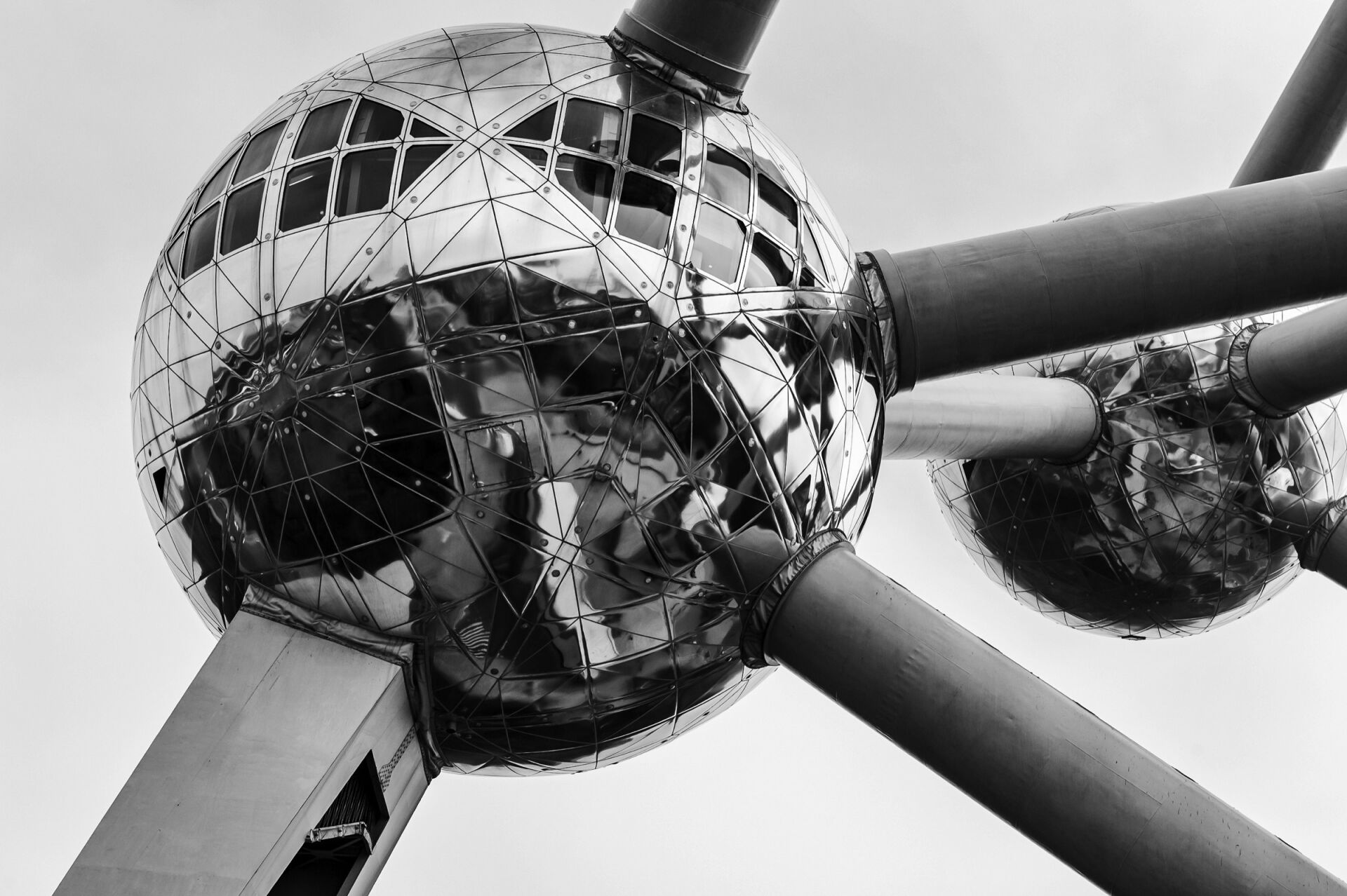
In black and white architecture photography, taking colour away is only the first decision. How light or dark the image becomes is the second, and on its own it can change how the same building is perceived. POSTRH, founder and sole juror of MONO ORBIT AWARDS, presents two frames of the same Barbican passage in London, shot with different camera settings, and two other projects of his: Geothermal in Iceland and Structures in Chernobyl.
Rather than converting colour files, this piece looks at what tone does to surfaces, mass and depth once colour is no longer there to separate them. In an earlier Journal article, POSTRH observed that tonal differences "can reveal structure, rhythm and spatial relationships we hadn't noticed before." The photographs below show what that means in practice.
Lighter tone
A lighter frame opens up the space
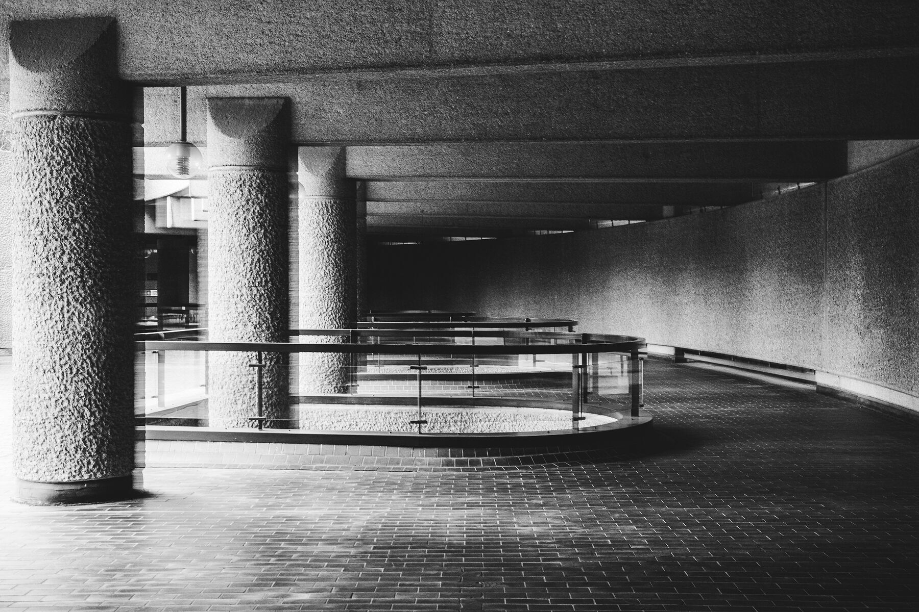
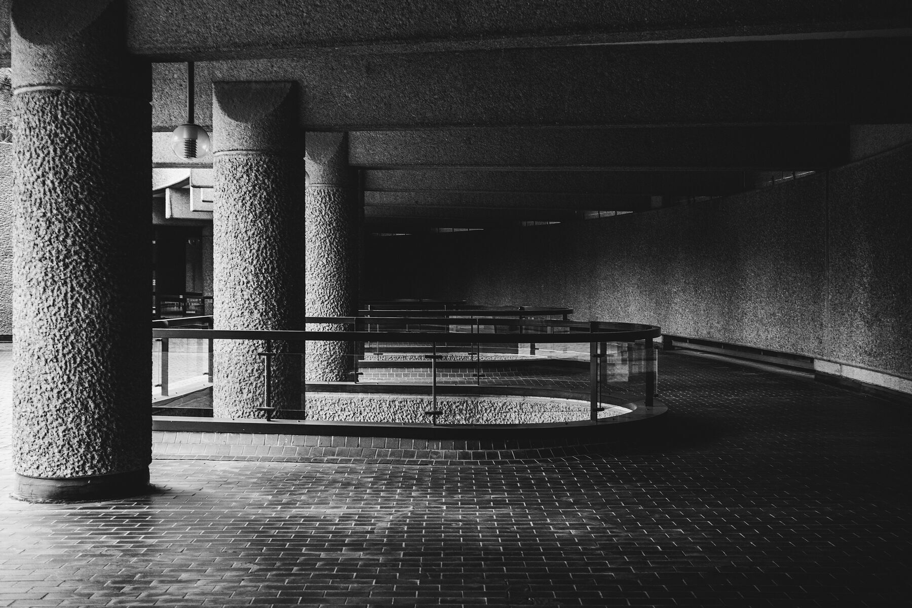
Both photographs were taken in the same covered passage of the Barbican: textured concrete columns, a railing and a wall that both curve away, and a tiled floor running into shadow.
In the lighter frame, the columns, the wall and the floor stay distinct from one another, so the relationship between surfaces, light and depth is easy to follow. The structure feels more accessible, and subtle tonal transitions let the eye explore the geometry of the building.
The lighter frame also carries camera shake; the darker one does not. For POSTRH, the imperfection brings a distinct sense of movement and gives the image its own visual rhythm. A photograph does not have to be technically flawless to have something of its own to say.
Darker tone
A darker frame gives the same architecture weight
In the darker frame, shadows take over. The ceiling and the curved wall recede, there is less visual information to read, and attention shifts to mass, contrast and geometric form. The columns, which in the lighter frame sit among the other surfaces, now stand forward as solid volumes. The same space gains a sense of weight and monumentality.
Neither frame is the correct one. As POSTRH puts it, "the comparison explores how tonal decisions can fundamentally change our perception of an otherwise identical architectural composition."
For an entry, the pair also recalls his advice on selection: "I would start by eliminating the photographs that repeat almost the same observation." Choosing the tone is part of choosing the photograph.
Geothermal
Where infrastructure meets the landscape
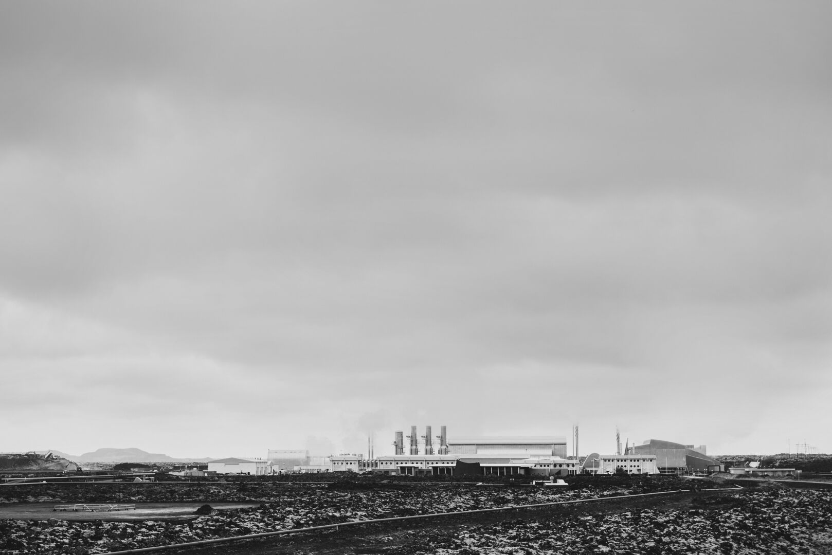
Geothermal, a project made in Iceland, explores the relationship between industrial infrastructure and the natural landscape. It takes the question from the Barbican outdoors: what happens to the line between the built and the natural once colour no longer draws it.
In monochrome, the distinction between constructed forms and their surroundings depends less on colour and more on texture, scale and light. Where a structure ends and the landscape begins is read from surfaces and light, not from a change of hue. POSTRH described the same effect in the first Journal article:
"Colour can separate objects that, in a monochrome image, begin to form a shared plane."
Structures
What remains when the function is gone
Structures examines the remaining forms of industrial architecture in Chernobyl. Removed from their original function, these structures reveal a different visual identity through geometry, material and the passage of time.
In the photograph at the top of this article, stacked panels and ribbed sheets form a wall of their own, with bent and cracked edges, weeds at the base and a heavy sky above. Monochrome draws attention to their physical presence and architectural character. Here, too, tone is a decision: dense blacks and bright, worn surfaces keep the eye on the material itself.
Interpretation
Tone as part of the statement
The two Barbican frames show that tone belongs to the photograph's statement, just like the choice of viewpoint, the edge of the frame or the use of light. It is the photographer's decision, and it shapes what the viewer sees first.
In THE CLOSED ROOM, where every eligible photograph of the first edition is reviewed, monochrome is read the same way: as a language that affects the way a place is perceived. For photographs entered for EMISSION, that makes the tone part of what each one says.
MONO ORBIT AWARDS / VISUAL INTERPRETATION
The tone of a photograph is a decision, not a finish applied at the end.
CURRENT EDITION / EMISSION
Entries close 6 January 2027.
JOIN THE ORBIT: enter EMISSION, the first edition